



All three worked inside PlayablesAI, from one brief and one folder of assets.
Every ad below is a one-shot. Each model got the prompt once, and we kept what it produced without following up or editing the files afterwards.
We chose Persona 5 as the target because its flashy, heavily stylized UI is difficult to replicate, which makes it a good test of whether a model can hold a visual style. With quality playables it is important for the creator to grasp the feel and look of the game it is targeting. Persona 5 made for an interesting reference to compare different models using PlayablesAI with.
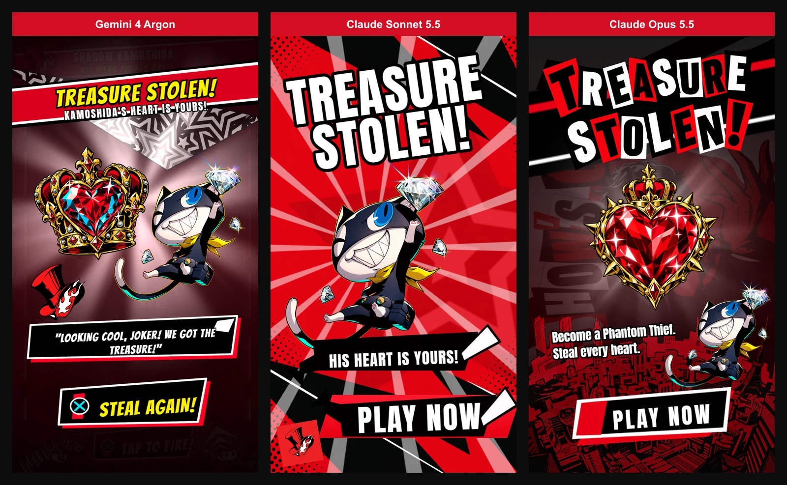
All three ads are live and take about a minute each to play through. Which one do you consider to have landed it the best?
What each model was given
The assets. One folder, fifteen files, identical for all three:
- Character and scene art — Character portraits, a city skyline background, a knife-on-wall, the star, the star banner and the top-hat logo
- UI reference — the ammo counter, the dialogue box, the popup sheet, the hold-up card and a general UI sheet containing many icons
- A video of the original all-out-attack animation
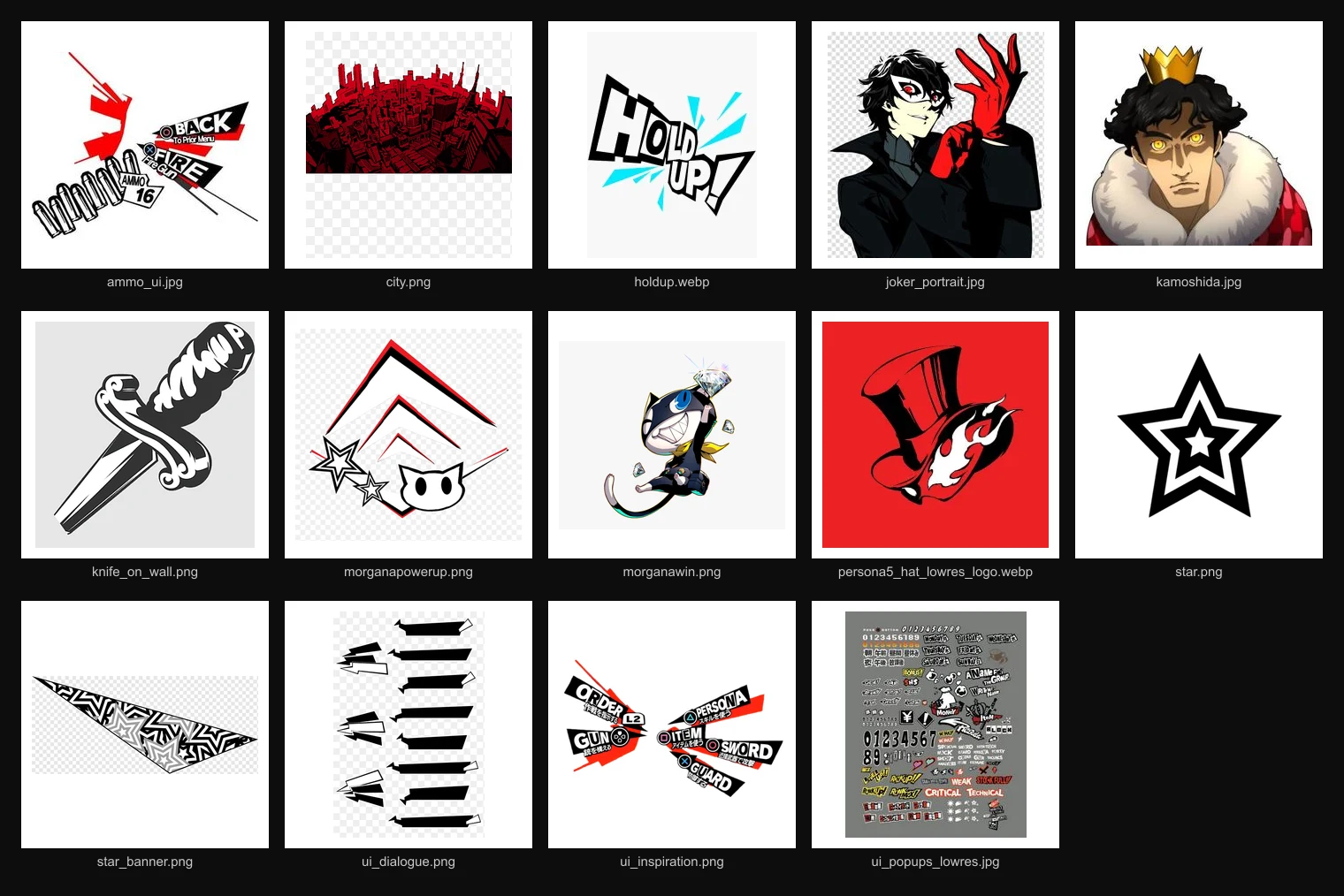
Nothing was labelled beyond the file names. PlayablesAI hands the model a set of tools for working with images: it can open an image and look at it, crop and trim pieces out of it into usable textures, resize them, and call image generation to make new art from an existing image as the reference.
PlayablesAI also provides video preview tools for the model, for reading a clip and pulling out frames and timings, so a model can rebuild the sequence as something that plays inside the ad. It can also cut assets out of the video if it needs them. How well each model used them to adapt the video was a deliberate part of this test.
Each model had to work out from the file names and the pictures themselves what every file was for, what needed cutting out of it, and where it belonged in the ad.
The prompt. About 150 words:
Gemini 4 Argon
Gemini got the core loop working. You shoot, the projectiles bounce and the weak points react. It also matched the game's color scheme, which is the most visible part of the Persona 5 look.
The problems:
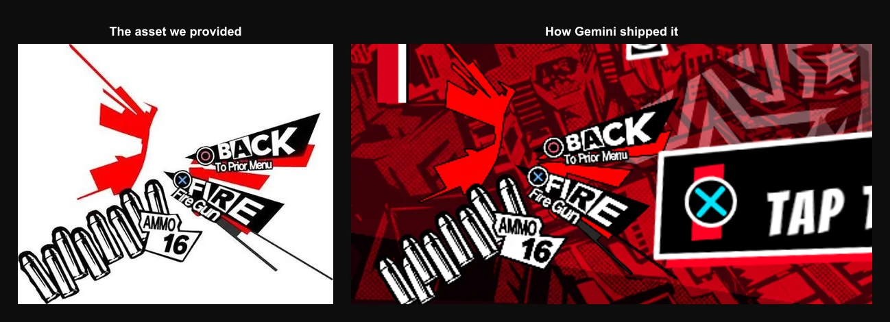
- The assets aren't cut to suit the ad. The ammo UI sprite still has the PlayStation button icons in it, taken straight from the reference screenshot.
- The ammo counter is a static image. Your shots don't visibly deplete, so the mechanic loses its main piece of feedback.
- The villain Kamoshida is obscured by the level bounds and is clipped.
- The knife obstacles are only part of a knife. Repurposing the knife art as moving obstacles is a nice idea, but the sprite is a knife stuck in a wall, so that is what floats across the playfield.
- The hit popups aren't styled like the game's. There is a "Weak" tag and a reasonably large "1 More" banner, so the beats are there, but the treatment is plain next to the original.
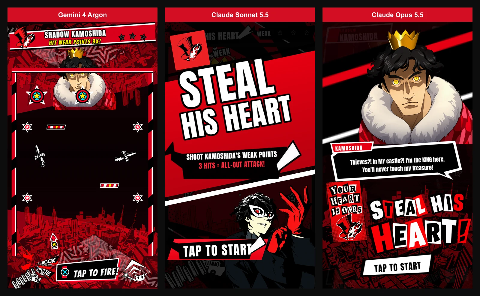
- Nothing onboards you. The ad opens straight into play. Starting in the game is a fair choice on its own, but no narrative sets up who you are or what you want, and the prompt telling you to tap sits small at the bottom, close enough in colour to the art around it that it is easy to miss on enter.
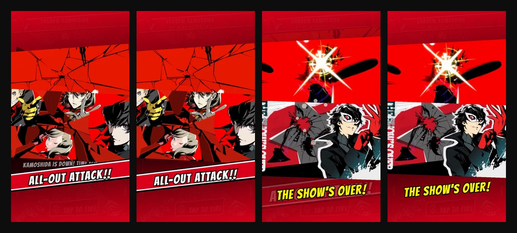
- There is no buildup for the climax. Gemini drops straight into the all-out attack the moment the third hit lands.
- The ending isn't animated. Gemini took still frames from the reference video and showed them in sequence. Very static.
Transitions and animations are basic throughout, and the result doesn't have the impact the original sequence has.
The ammo counter and using plain video screenshots to deliver the climactic animation are the clearest omissions. The ask was a faithful recreation that made sensible use of the assets we supplied. The ammo counter never changes, which is a lot to leave out of a mechanic built on spending shots, and the ending shows stills from the reference video rather than rebuilding the sequence from it. On both counts the goal was not met well.
Claude Sonnet 5.5
Play Claude Sonnet 5.5's version
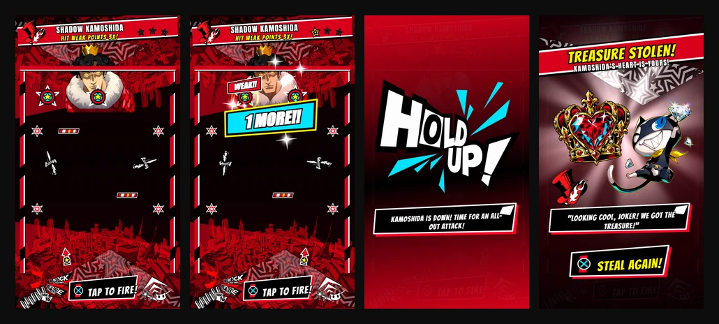
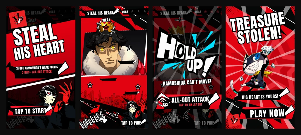
Sonnet produced a more complete ad. It built an intro screen and staged the ending as a real animated sequence, already a step-up from Gemini.
The gameplay is different from Gemini in the sense that the aiming tracks the pointer, instead of having just a button to time the moving gun. For the moving obstacles, it used the game's dialogue popups - an interesting decision. The villain portrait is not obscured by level bounds as with Gemini and a layered background drop to the portrait has been added in the style of the original game.
Sonnet also used the PlayablesAI tools to cut the PlayStation button prompts out of the ammo art, which Gemini left in. This is a considerable improvement also taking in the fact that the ammo counter is dynamic. When shots run out, and reloading has its own UI and a wait you have to sit through.
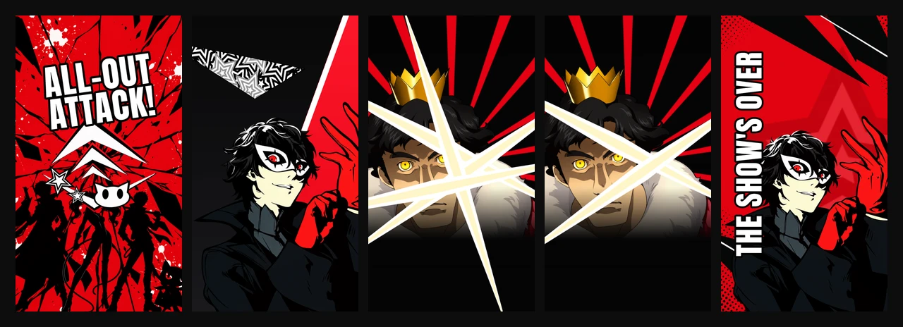
The all-out attack sequence is built as a face-off and is animated using PlayablesAI transitions. A hold-up card freezes Kamoshida and hands the trigger to the player, then Joker cuts in and Kamoshida takes the hits across a run of slashes before the show's-over card. It is a much simpler sequence than the reference, and more directly confrontational, but it drives a similar climactic feel.
For the standoff it used PlayablesAI's image generation to make a new image of the team. It did not opt to animate them at all, which makes for a relatively stiff sequence from an exciting, lively reference.
The feel is a clear improvement on Gemini's, though still not a match for the reference we gave it.
There are fixes to do on the subsequent prompts:
- Text is misaligned in several places, the ammo counter in particular.
- The line texture behind WEAK and HOLD UP isn't masked properly, so it reads as a clipped texture.
- The end screen's background animation doesn't loop properly.
- Joker is obscured by the level bounds, the same way Kamoshida is in Gemini's build.
- The knife obstacles are only part of a knife, the same as in Gemini's build.
Claude Opus 5.5
Play Claude Opus 5.5's version
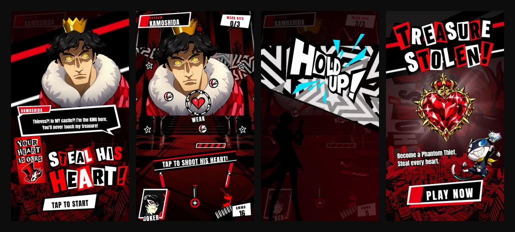
Opus put a calling card in its intro, a concept from the original game exempt from the prompt. That art wasn't in the folder we supplied, so Opus described it to PlayablesAI's image generation from what it already knew about the game.
It also used PlayablesAI's image generation for the Persona 5 lettering, baking it into image assets with separate art files for WEAK, CRITICAL, ONE MORE, ALL-OUT ATTACK and TREASURE STOLEN. The other two wrote out their texts using a simple font. This makes the one-shot from Opus look much more convincing from the get-go as a playable ad for the game.
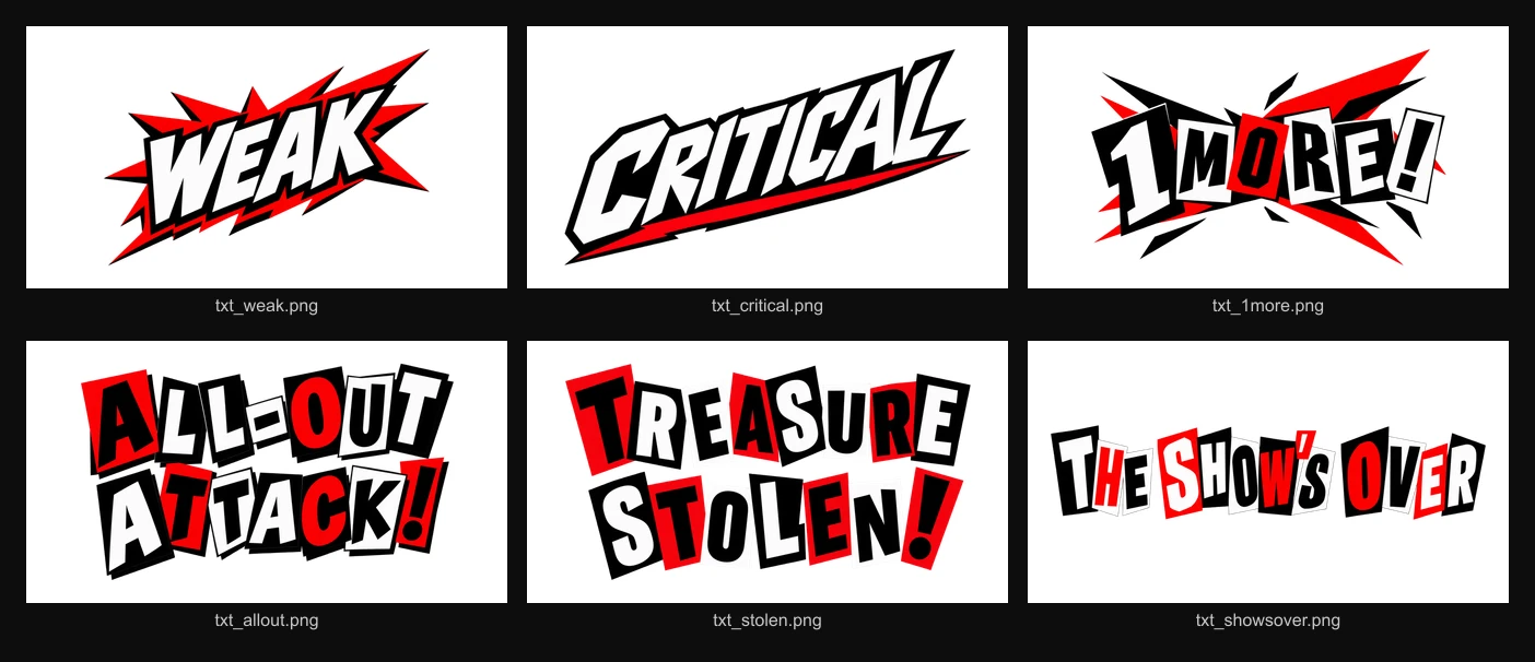
Where Opus pulls ahead is feel: timing and animation.
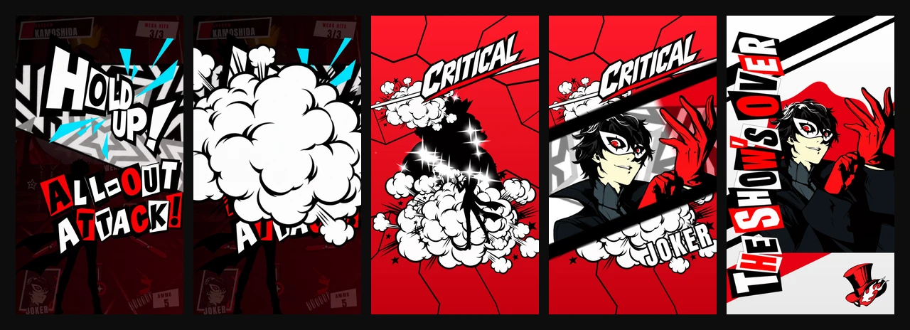
Its all-out attack runs as thirteen distinct beats: the slam, the wipe, three landed hits, the critical, the cut-in, the flash, the silhouette, the closing card. Opus gives each beat enough time to land before moving to the next one, much different from the static imagery of Gemini and a step above the animation of Sonnet.
It also gives a single hit the most room. "ONE MORE" arrives as a full-width slam across the lower half of the board, in the game's own cut-out lettering.
It isn't clean throughout. Kamoshida's portrait still doesn't sit neatly in the environment: the hard edge of the cutout is visible where it meets the room behind him. The all-out attack in itself is closer in impact but the effects such as static clouds could use iteration.
Side-by-side
Shot depletion:
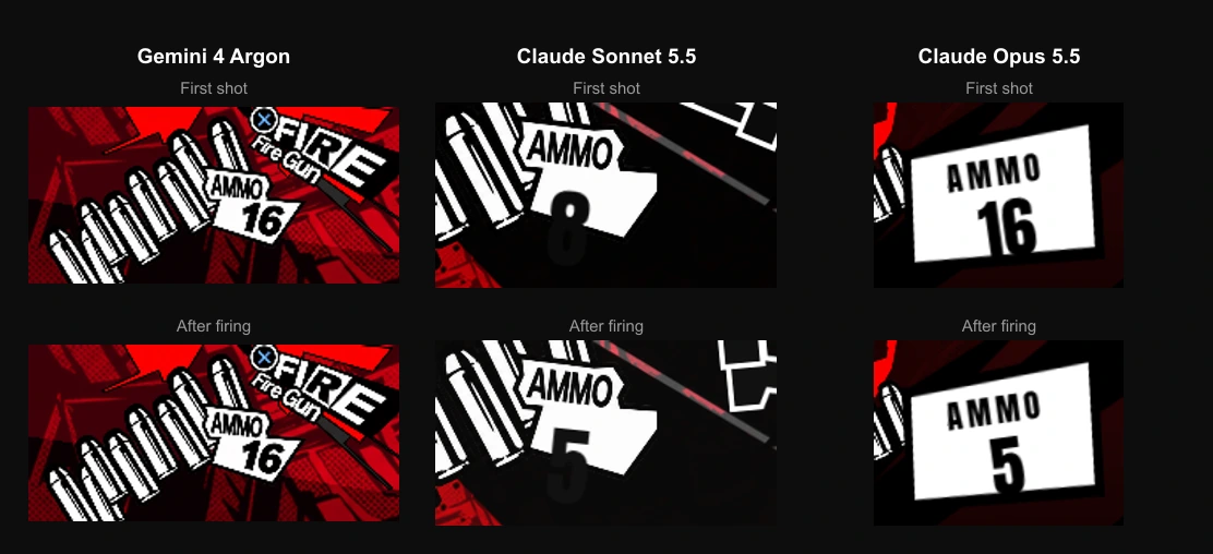
None of the three punishes you for running out of ammo. There is no penalty and no reason to aim carefully. No model reached for it on first pass, though it is something additive for a later prompt.
Comparing animation in numbers
The difference in feel can be seen in numbers between Claude and Gemini.
Gemini has no intro at all, and it spent a fraction of what the other two spent on the all-out attack. Both Claude models put three to four times the animation into the ad that Gemini did. Gemini has neither the feel nor the faithful animation, and the counts show it.
Why not use the video directly?
Considering we had a video of the exact sequence we wanted, one might question why not just use the video directly in the ad.
There are multiple reasons. The main one is size: ad networks have strict budgets and video doesn't fit inside them easily. The second is that with animated sequences it's easier to adapt to different aspect ratios, such as between portrait and landscape.
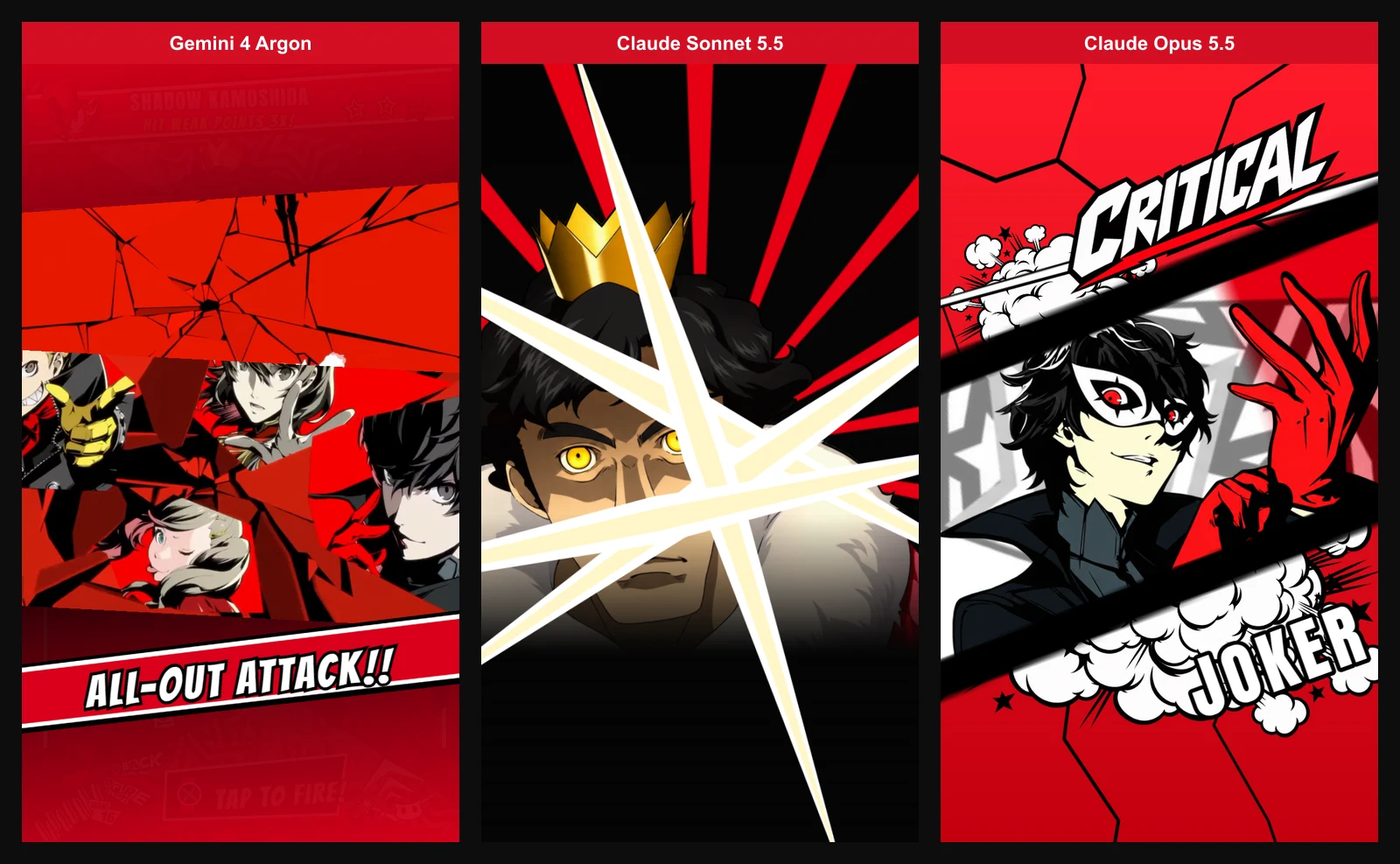
Furthermore, defining the sequence using PlayablesAI layout transitions is easily further customizable and editable by the AI. The PlayablesAI tools offer the AI a way to quickly edit animation transitions and also visually verify how the ad looks mid-transition, so iterating an animated sequence is made easy.
Worth remembering that this was the initial prompt, so further honing is simple to ask for from PlayablesAI afterwards.
Iterating on the Opus playable
We kept iterating on the Opus playable. These prompts are a lot lighter to iterate with, considering there is already a base to work from.
The first prompt took around 15 minutes to complete. The whole second pass took about 45 minutes. The finished ad publishes as an MRAID package at 2.74 MB.
What we took from this
The differences showed up in pacing: how long a moment holds, how hard a hit lands, how much of the screen an effect is allowed to take. Opus got those right consistently. It was also the easiest to start building from, which after iteration led to the more polished version of the playable, closest in nature to the original game.
At their best, playable ads work as a filter: they help players find the games they will stay with. Getting the feel right is a large part of that, and feel is not only gameplay. It covers narrative, pacing and faithfulness to the original game.
PlayablesAI uses Claude Opus 5.5 by default, since it continues to deliver the best performance for realizing playable ads for your own products using your assets.
- Gemini 4 Argon's version (one-shot)
- Claude Sonnet 5.5's version (one-shot)
- Claude Opus 5.5's version (one-shot)
- The polished version